
RESPONSIVE WEB DESIGN
Responsive Websites
That Look Great on
Every Device
________
We design and build mobile-friendly websites that deliver a seamless experience on desktops, tablets, and smartphones. One website. Every screen. Every time.
Mobile-First Design
Built to perform beautifully on every screen.
Fast Performance
Optimized for speed, stability, and user experience.
SEO-Friendly Structure
Clean foundations designed for visibility and growth.
Better User Experience
Clear, intuitive pages built to guide more customers.
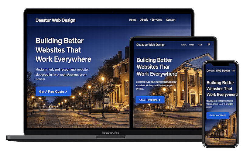
More Than Just a Good Look
A responsive website adapts to every screen size, helping visitors browse, read, click, and convert without frustration.
Custom Mobile Layouts
Designed specifically for mobile users, not just shrunk-down desktop pages.
Better User Experience
Easy to navigate, read, and interact with on any screen size.
Faster Mobile Performance
Optimized for speed so your site loads fast everywhere.
SEO-Friendly Structure
Responsive design supports better rankings and stronger search visibility.
Higher Conversions
A better mobile experience helps more visitors take action.
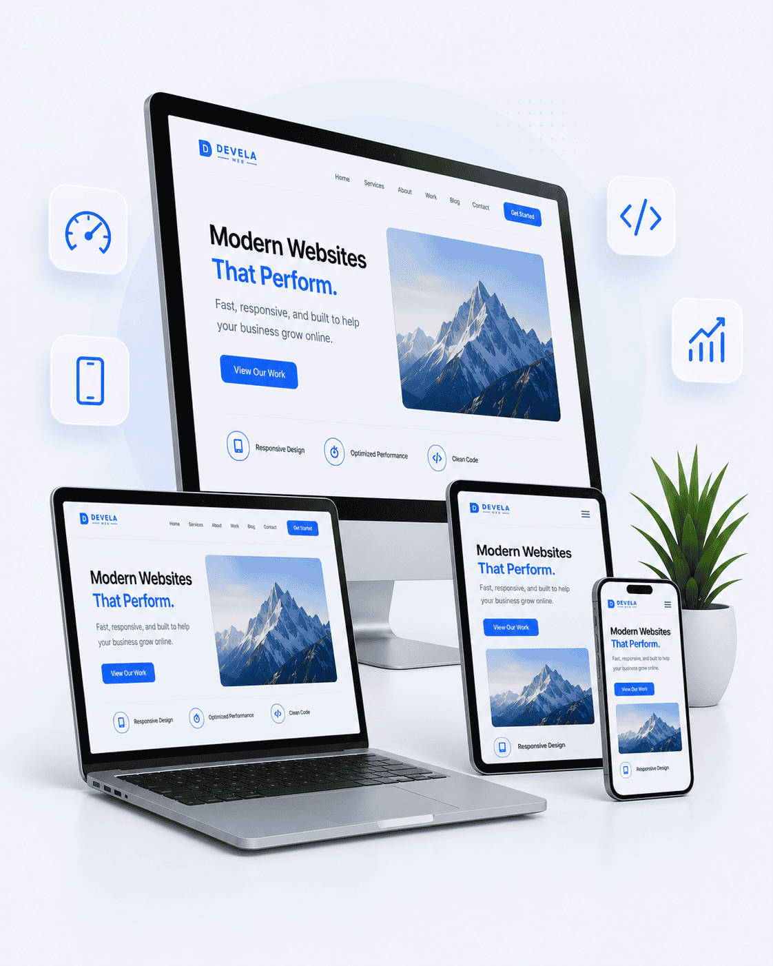
Built to Perform on Every Device
Your website should work beautifully whether someone visits from a desktop, tablet, or phone. We design responsive websites that adapt naturally to each screen size while keeping your brand consistent.
From mobile navigation and flexible layouts to speed optimization and cross-device testing, every detail is built to create a better user experience and stronger business results.
Responsive Website Design
Mobile-first designs that look polished on every screen.
Mobile-Friendly Development
Clean code and flexible layouts built for all devices.
E-Commerce Responsiveness
Online stores optimized for convenient shopping on every device.
CMS Integration
WordPress and custom CMS layouts that adapt seamlessly.
Website Speed Optimization
Fast-loading pages built for strong mobile performance.
Testing Across Devices
Real screen-size testing helps ensure a smooth experience.
Does Your Website Have These Problems?
Text Too Small to Read
Hard-to-read content frustrates visitors.
Buttons Hard to Tap
Tiny buttons lead to missed clicks and lost leads.
Layout Breaks on Mobile
Elements overlap, stretch, or fall out of place.
Slow Mobile Load Times
Slow mobile sites lose visitors and rankings.
Poor Tablet Experience
Tablet layouts need more than phone or desktop styling.
Bad Mobile Navigation
Confusing menus hurt user experience and conversions.
A Clear Process for Every Screen
We plan, design, build, and test every responsive website to deliver a consistent experience across desktop, tablet, and mobile devices.
Device & Audience Review
We evaluate your goals, visitors, content, and the devices customers use to access your website.
Responsive Planning
We map the content hierarchy, breakpoints, navigation, and layout behavior for each screen size.
Adaptive Design
We create polished desktop, tablet, and mobile layouts that maintain your brand and improve usability.
Cross-Device Development
We build clean, flexible layouts that adapt smoothly across browsers, devices, and changing screen widths.
Testing & Optimization
We test responsiveness, speed, navigation, forms, and usability before launch and refine anything that needs improvement.
Your Website Should Look Great on Every Screen
A responsive website improves user experience, strengthens SEO, increases conversions, and helps your business stay competitive. Devela Web builds fast, mobile-first websites designed to perform beautifully across desktops, tablets, and smartphones.
Huntsville
Businesses
Madison
Companies
North Alabama
Services
Tech &
Engineering
Healthcare &
Medical